
Toraji’s “Reading” Print: A Case Study
9/23/2015

by Darrel C. Karl
I’ve always been fascinated by the manner in which artists conceive and realize their vision in the woodblock print medium. Some, like Kawase Hasui, would produce a watercolor that would be traced by one of Watanabe’s carvers as a basis for creating the keyblock. Hashiguchi Goyō, on the other hand, would usually execute a series of sketches culminating in a highly finished pencil drawing that used shading to impart three-dimensionality to his composition. Then, since woodblock prints are inherently a flat medium, Goyō would redraw the image again, usually in one or more ink drawings, flattening out the image and reducing his pencil drawing down to its basic essentials. This final drawing would then be copied and used to carve the keyblock. Based on the notations found on his final drawing for his 1918 print “Woman Applying Make-up,” for example, Goyō appears to have worked out in advance exactly what colors he intended to use on his prints.
Ishikawa Toraji (1875-1964) appears to have followed both approaches as means for creating the keyblocks for his prints. His landscape prints generally are based on oil paintings, although he would nonetheless generate original pencil or ink drawings reducing those landscapes down to their essential lines. (The large size of many of those oil paintings would have precluded tracing as an option.) Most of his nude prints, however, appear to be fanciful, imagined compositions (albeit ones that used his wife as the model) based on pencil or ink outline drawings created merely as a means to the end of producing those prints. Even in cases where a related oil painting is known to exist, the model’s pose and the background details differ considerably from those in the final print. As an artist, Toraji’s draftsmanship skills cannot compare to those of Goyō. But Toraji’s prints are not about line, they are about color. What makes Toraji different from both Hasui and Goyō is that he had no preconceived notions about the colors and patterns to be used in his nude prints. Rather, they were worked out only after the keyblocks had been cut and printed.
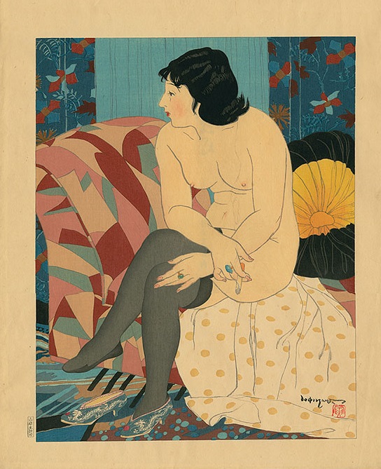
About a dozen years ago, when Toraji’s house was about to be torn down, Toraji’s relatives found a trunk in the attic of the house that contained Toraji’s preparatory drawings, watercolor studies, and printers’ proof for most of Toraji’s print designs, along with certain other material going back as far as the turn of the last century. I acquired the bulk of this material, from which one can more or less recreate Toraji’s composition process for such prints. I’ve selected his 1934 print “Reading” from the series “Ten Types Of Female Nudes” to illustrate this process.
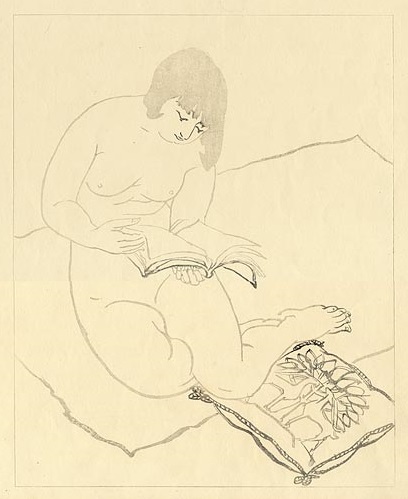
Unfortunately, the preparatory pencil drawing for “Reading” does not appear to have survived or, if it has, its current whereabouts are not known. But in light of other preparatory drawings I have for other designs in this series, it would have looked substantially similar to Toraji’s grey block print for “Reading.” (Although I have grey and black keyblock impressions in my collection, multiple copies of such prints exist and, for convenience, I have used images found on The Art of Japan’s website.)
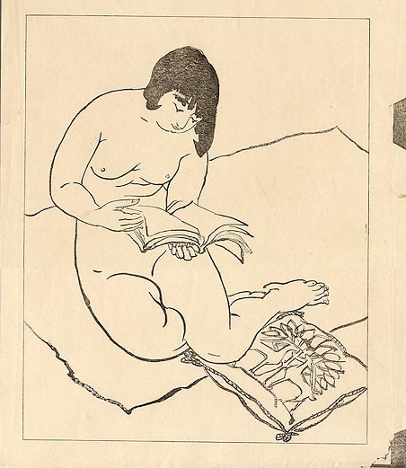
Toraji would also typically produce a black keyblock impression with certain portions (such as the woman’s hair) also test-printed in black. The kento registration marks can be seen in the right margin of the print.
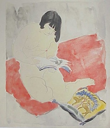
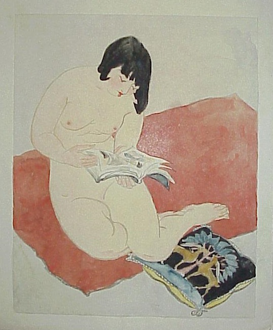
Toraji would then take one of the grey block impressions and hand color the print with watercolor. In one such example (presumably his first attempt), the carpet is plain and painted light red and the pillow is painted yellow and blue with black trim.
Toraji would repeat this process several times, experimenting with various color combinations. In another example, the carpet is painted a darker shade of red, and the colors on the pillow are reversed.
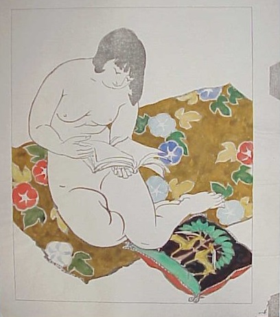
At some point, Toraji decided that the carpet needed a pattern and he experimented with a brown carpet employing a morning glory motif. The black background of the pillow was retained, but blue and yellow colors were replaced with green and red.
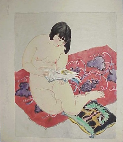
I think Toraji correctly concluded that the morning glory pattern was not particularly effective in the context of this design. Consequently, he reverts back to a red carpet, but decides to try out a grapevine motif. The red trim of the pillow is changed to yellow, but is otherwise unchanged.
Toraji must have been satisfied with this version, as it is the version he ultimately used to generate the color blocks employed in the final print. While Toraji did not carve or print his own designs, he nevertheless oversaw and controlled the printing process. Printers’ proofs for many of his print designs survive and are covered with Toraji’s detailed notes to the printer regarding necessary alterations in the colors/shades to be used, or in the way certain areas were to be printed.
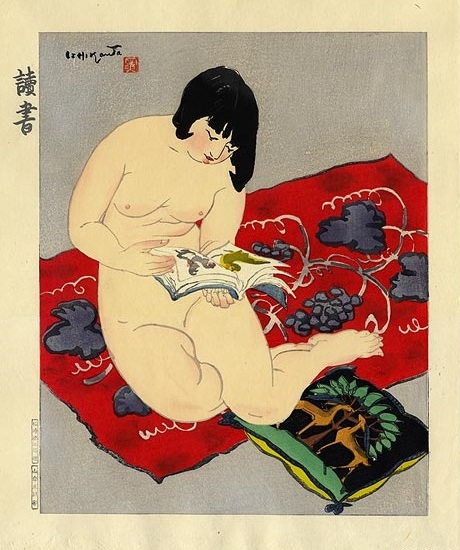
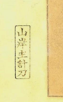
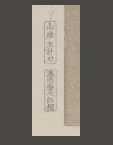
As noted, the illustrated print is a later printing of this design. A first edition print in the “Ten Types Of Female Nudes” series is distinguishable from all subsequent states by three criteria. First, the title of a first edition print does not appear in the upper left margin as in the above print, but on a protective sheet of tissue paper that covers the print. (The protective sheet is often missing, having been lost or discarded over time.) The absence of a title, however, is not conclusive by itself, as later printings without the title on the print are known to exist. (Conversely, some later printings were issued with blank protective sheets.) Second, a first edition print bears one and only one cartouche in the lower left margin, one that identifies the carver as Yamagishi Kazue. Finally, the first edition print will be printed on paper watermarked “Ishikawa Toraji.” (Later printings during Toraji’s lifetime, however, were also printed on such watermarked paper.) If all three criteria are met, the print is a first edition print.
These considerations do not necessarily apply to Toraji’s other prints. For example, the title appears on the first (and possibly only) state of the nude print “Playing” which was issued outside of the “Ten Types Of Female Nudes” series, as well as on first edition printings of Toraji’s landscape and seascape prints. In the case of “Resting” (aka “Relaxing”), there was only one edition ever printed, because the government considered the design to be licentious and had the woodblocks confiscated and destroyed. As a consequence, no version of “Resting” exists with the title appearing on the face of the print.
Later printings of “Reading” generally will include the name of the printer in a second cartouche. The second edition (like the first edition) was printed by Urushibara Eijiro (1882-1943), whose name appears in a cartouche below the carver’s cartouche, as illustrated below. Copies subsequently printed by Matsuzaki Keisaburō (born 1937), have his name in a cartouche located above the carver’s cartouche. Yamagishi Kazue’s cartouche on the second edition print is the same as that on the first edition print, but appears in a somewhat different form on later printings. Copies printed by Matsuzaki Keisaburō, however, should still be considered to be lifetime impressions if they were printed on Toraji’s watermarked paper. Prints lacking both carver’s and printer’s cartouches will either be trial proofs or else posthumous printings by some unknown individual.
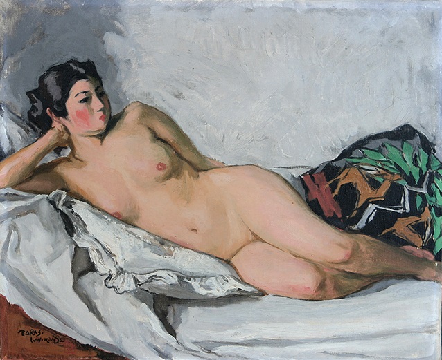
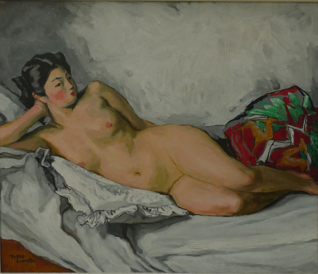
Interestingly, the pillow depicted in the “Reading” print appears to have been an actual pillow found in Toraji’s studio. It appears in at least three of Toraji’s oil paintings, two of which are illustrated below. In each case, the colors of the pillow are different. Regardless of the colors of Toraji’s actual pillow, it is apparent that he would modify them as necessary for aesthetic reasons.
Coming from a painting background, it is Toraji’s color sense, rather than his affinity for line, that make his prints so successful. Of course, the subject matter of his “Ten Types Of Female Nudes” was intended to be mildly titillating, and the art deco design details in prints like “Resting,” “Morning,” and “Blue Cockatoo” made them au courant. But the keyblock prints are rather static when viewed in isolation. It is Toraji’s use of color that truly makes these designs come to life.
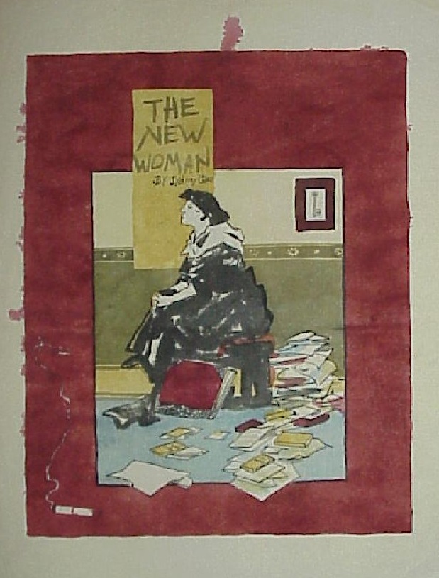
In part, Toraji’s color sense can be traced back to the time Toraji spent in Paris around 1902-1903 where he was undoubtedly exposed to the work of French artists such as Henri De Toulouse-Lautrec and Pierre Bonnard, among others. In addition, Toraji appears to have been greatly influenced by the Maitres de L’Affiche posters produced during La Belle Époque (to which both Toulouse-Lautrec and Bonnard contributed), so much so that he made his own watercolor copies of 40 or more poster designs from that series. (These watercolor copies were among the various other things found in that trunk in Toraji’s attic.) Upon his return to Japan in 1904, Toraji wrote an article about the Czech Art Nouveau painter Alphonse Mucha in the literary magazine “Myōjō, who designed seven of such posters. Since many of the artists who designed those posters were under the spell of Japanese prints at the time, we see the effect of Japonisme coming round full circle in Toraji’s own prints.